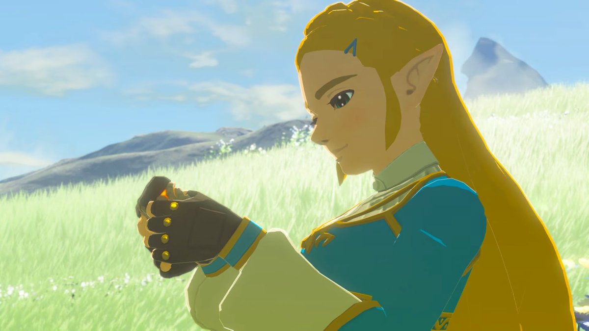
Legend Of Zelda Art Director Talks Series Visual Style
When it comes to video game franchises, you never can count on things being the same as they advance through the series. That would be illogical, or bad game design as we’ve seen in certain cases. Things have to change and evolve in order to stay fresh and stay fun. However, when it comes to the visuals, most developers will stay with their “base” look and then just improve it to ensure that they match the tech specs. But for The Legend of Zelda, they’ve always pushed for more unique visuals instead of sticking to one style.
You can find this in the first two games where they went from top-down 2D visuals to a more side-scrolling style. Then with Ocarina of Time they went 3D, but still kept the 2D games going too. And if you compare Twilight Princess to Skyward Sword, you’ll see a massively different tone and style between the two.

In the “Creating A Champion” book, which detailed the creation of Breath of the Wild, the latest Legend of Zelda game, art director Satoru Takizawa talked about why the series has always had a desire to keep changing the visuals.
“I imagine there are a lot of people who have wondered why the visuals for The Legend of Zelda change with each new entry in the series. We look for the best way to express the unique spirit of that particular game and create a world that will be exciting for players to jump into and explore. Often, the results come from trial and error.”
In regards to why Breath of the Wild looked the way it did, he noted that they really wanted to represent the “open world”, and tried to capture the spirit that it was showing off. The result was another unique look, and one that got a lot of praise from fans.


